Human Computer Interaction
WELCOME TO
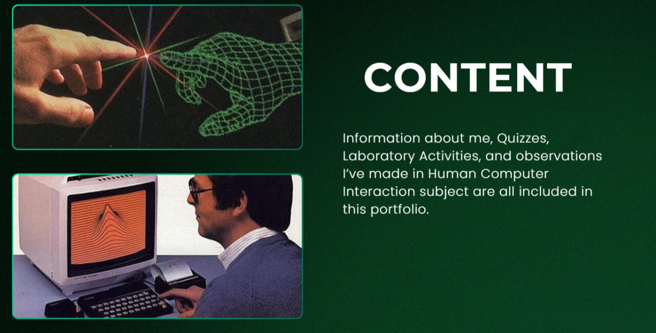
MY PORTFOLIO

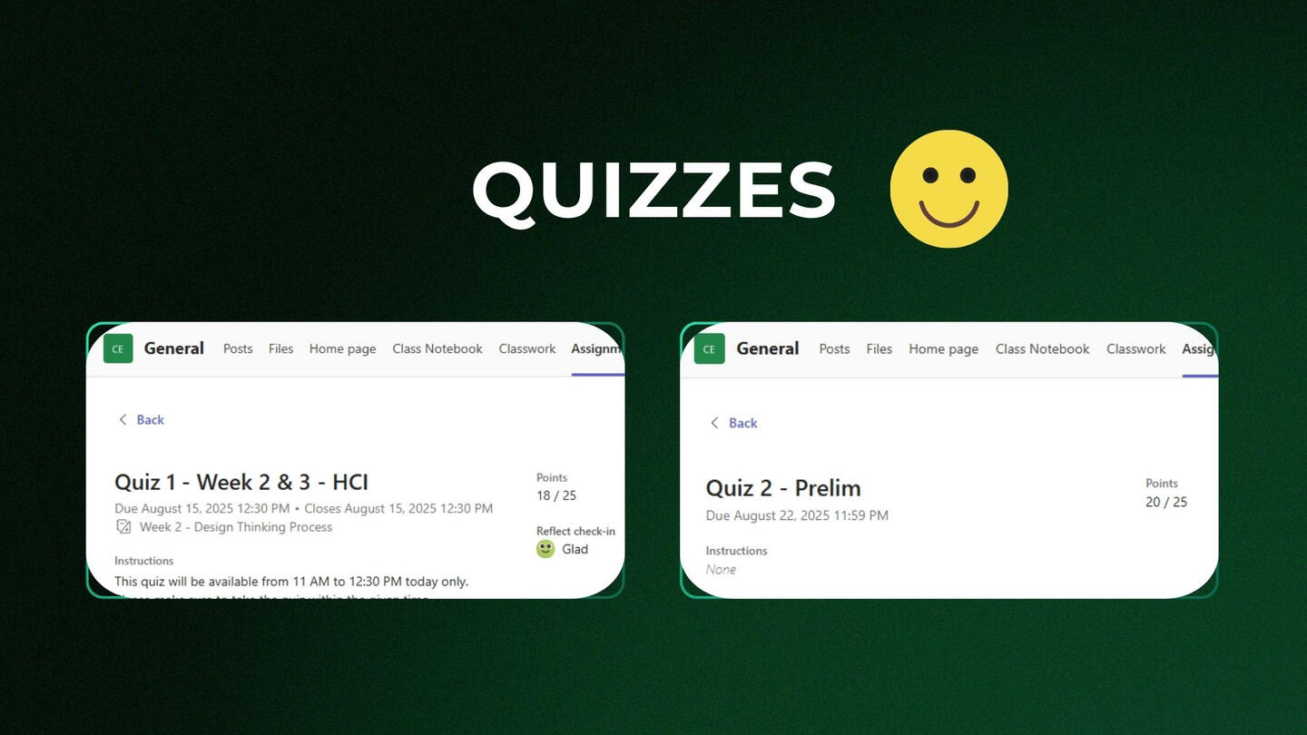
Quiz 1 - Week 2 & 3
In Week 3, we explored what makes a design good or poor from a user's perspective. I learned that good design focuses on ease of the use and clear interaction, whereas poor design often leads to user frustration. As part of this, we did a group work and documented examples of effective interaction design on campus.
Quiz 2 - Week 4
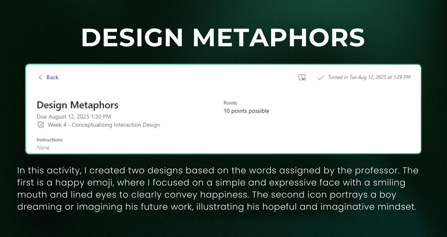
In week 4, we discussed conceptualizing interaction design and learned about what are the required in interaction design, including conceptual model. As part of the class activity, we created an icon based on the words assigned to us by the professor.
LABORATORY ACTIVITIES
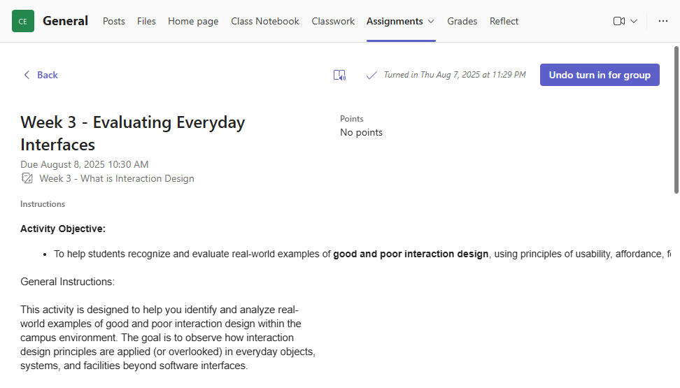
Evaluating everyday interfaces
For this activity, our group conducted on-campus observations to identify examples of good and poor interaction design in everyday objects and systems. We carefully selected functioning items such as classroom equipment and building facilities, ensuring they were publicly accessible and free from damage. Each member contributed by taking clear photos and analyzing the design based on principles like usability and accessibility. We then discussed our findings together, pointing what made certain designs good or poor, and proposed improvements for the poor examples.
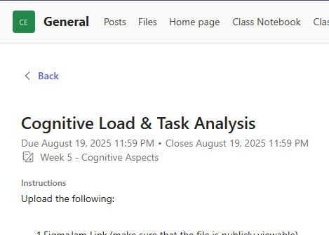
COGNITIVE LOAD & TASK ANALYSIS
For this group activity, our group, SB Girls, worked together to map out step-by-step processes for tasks like finding grades and class schedules in JRU Swit, locating classrooms, requesting documents, and managing Messenger interactions. We focused on simplifying these tasks to reduce cognitive load and improve usability. Our work was compiled into a publicly viewable Figma file.
preliminary reflection
These activities have deepened my understanding of interaction design from multiple perspectives. In Week 3, I discovered that while bad design leads to irritation, good design places a higher priority on usability and clear interaction. I was able to use these concepts in real-world scenarios. I was first exposed to conceptual models in interaction design in week four, and making icons gave me a creative and visual way to communicate concepts. Using the app to explore poems and stories increased my empathy and user experience appreciation. Lastly, my group's analysis and simplification of typical tasks in JRU Swit and Messenger emphasized the need of lowering cognitive burden for improved usability.
Thank you
For Visiting!

Quiz NO.1
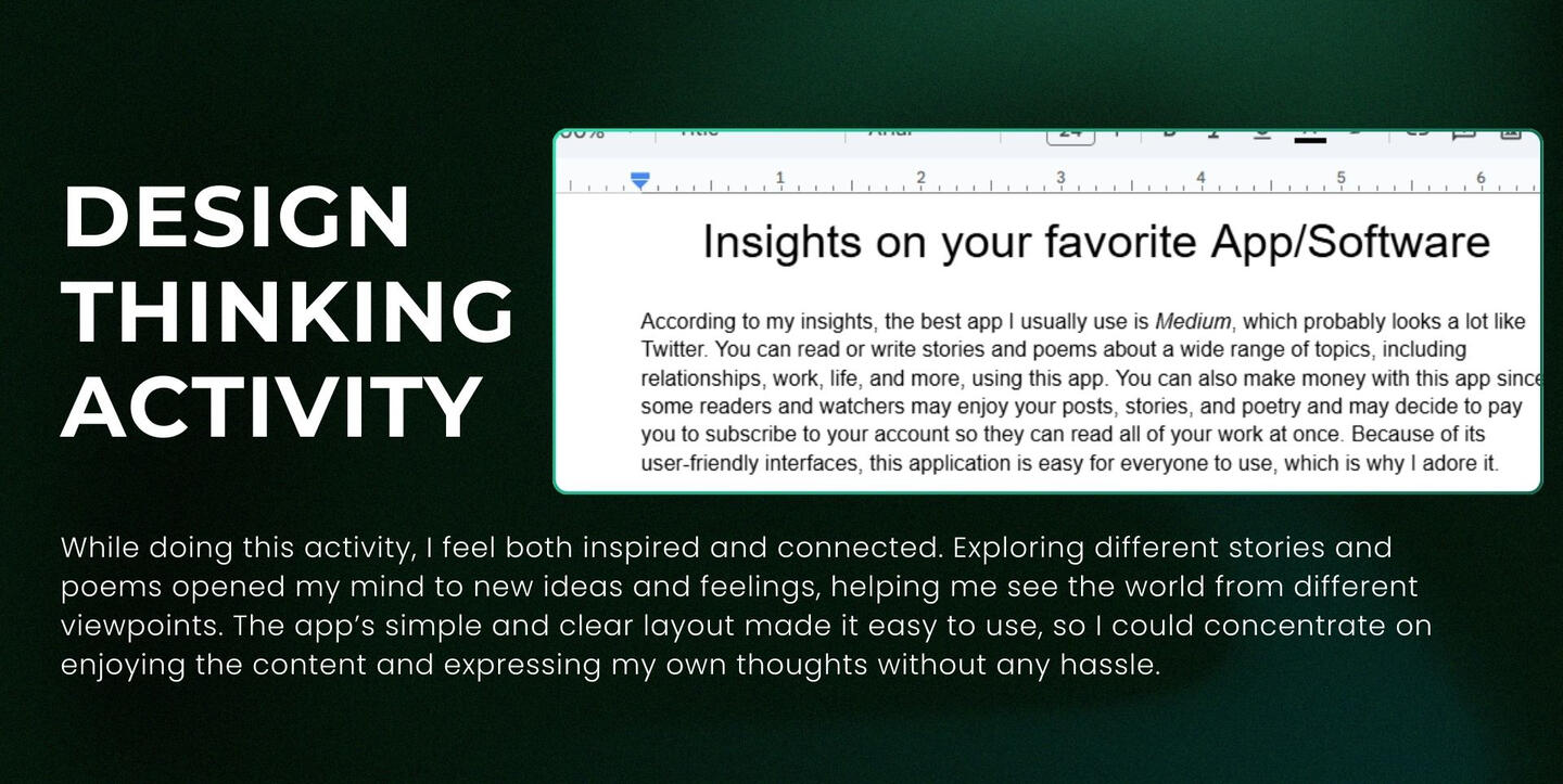
Activities
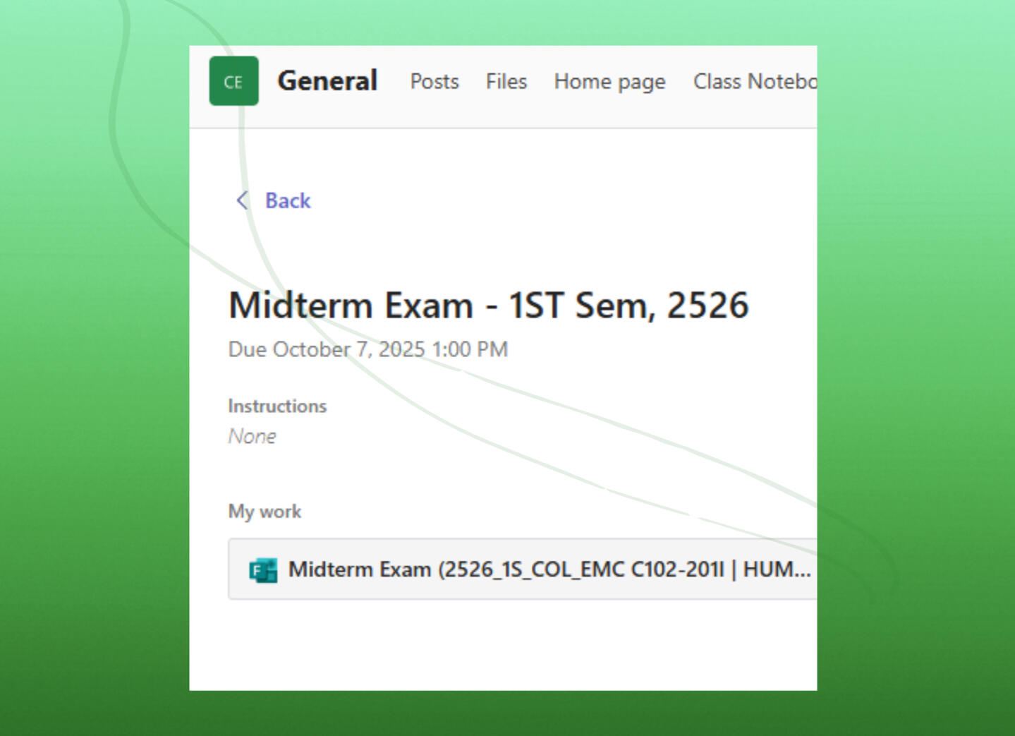
exam